A new icon for Pennsylvania
Our PA Flag
A new design
Why?
Flags are a symbol of civic pride. An iconic flag design can be remixed and incorporated into the very fabric of a community. But a poorly designed flag can instantly be forgotten and ignored, and in the worst cases, actively hidden in shame. Below, Roman Mars gives an excellent TED talk on why flag design matters:
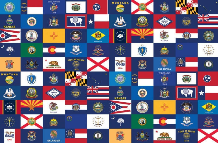
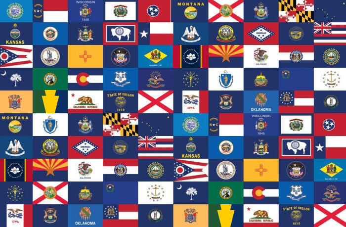
In a time where our divisions are more visible than they have ever been, it’s imperative that we have an iconic symbol to rally under that can remind us of our shared interest in this commonwealth and in each other.-Now, a quick experiment. Below are the 50 US state flags. How quickly can you find Pennsylvania?

Were you even able to find it? The distinguishing features are so small and hard to make out. Now go back, and look for our neighbor Maryland.-Bet that didn't take as long. You might have noticed it appears twice! In fact, so did Pennsylvania, but it disappears into the sea of unremarkable seals on blue fields. We can do better.-Try it again with the grid below, then read on to see how we got to this design that is so quickly identifiable.

Creating an icon
The Design
Inside every bad flag is a good flag waiting to get out, so let's see what we have to work with:

Let's start with the focal point (if there was one) on the existing flag: the escutcheon (shield) in the Coat of Arms, which can also be found in the State Seal. This comes with its own symbolism baked in, which also translates when simplified to just the three main colors: green, gold, and blue.Now that we have a tricolor palate (we'll choose the blue from the field rather than the crest, which we'll talk about later in Symbolism), we can look to timeless, tried-and-true tricolor flag designs as a starting point. Here, we will choose the palles (vertical lines) over the fesses (horizontal lines), for reasons we'll explain in a moment...

Color symbolism can do wonders on its own, and keeping it simple is good for flags, but it doesn't quite feel like "Pennsylvania" yet - these colors could mean anything. So we add a uniquely Pennsylvania twist - turning the middle pale into a keystone, the only existing recognizably Pennsylvanian icon.

After experimenting with several different proportions, we settle on one that is balanced and easily replicable any way you stretch it, to ensure the keystone is still recognizable in a stiff breeze and the tricolor is identifiable. When there is no wind, this design actually resembles the escutcheon we started with! (We used this flag waving tool to experiment.) The top part of the keystone takes up 1/4 of the height, and at its widest is 1/3 of the flag width. The bottom part takes up 3/4 of the height, and at its widest is 1/2 of the flag width. Both parts of the keystone are 1/4 of the flag width at their narrowest.

Finally, we decide how the flag will be displayed. With a few exceptions, the "hoist" (the part of the flag affixed to the pole) is on the viewer's left (a "dexter hoist"). We'll place it on the right (a "sinister hoist"), not just to be unique or contrarian, but for the sake of symbolism, which we detail in the next section:
Why things are what they are
Symbolism
While Pennsylvania's current flag design is not particularly good for a flag, there is a lot of symbolism in the coat of arms that deserves to be carried forward.This flag's design closely resembles a tricolor, because aside from the distinctive Keystone shape (to represent Pennsylvania's identity as "the Keystone State"), those three colors alone can carry all of the symbolism from the traditional flag, and then some more.Remember that our design is derived from Pennsylvania's state seal and coat of arms, featured in the current flag. The meanings in this state seal carry over, maintaining the tradition of the flag: green for "wealth of human thought and action," gold for "rich natural resources," and blue for "state commerce being carried worldwide."This also creates a (very) rough map of our geography: green for our western hills and mountains, gold for rich farmland in much of the midstate, and blue for our eastern border along the Delaware river, a major point for "state commerce" mentioned earlier.These colors may also be used to carry over the tradition of the state motto, "Virtue, Liberty, and Independence." While these words are in written form on the current flag, near impossible to see at a distance or when flying, the three colors wind up being sufficient - green for Virtue (aligns closely with human thought and action), gold for Liberty, and blue Independence.This last point allows us to tie our identity as a Commonwealth back to our identity as a US State: we fought for independence as part of the original thirteen colonies that became the United States. That is why the blue is darker, and why the hoist is on the sinister/right/blue side: to match the blue on the US flag, as does the background of our current flag. This also fulfills the symbolism of the Eagle on top of the escutcheon in the Coat of Arms on the original flag.All of the symbolism in the original flag (and then some), but instead of complicated designs and writing that is impossible to see or appreciate when flying, it's carried by three simple colors you can actually see in the wind (or no wind at all).Many of these meanings were sourced from Pennsylvania's official government page listing state symbolism.
FAQs
As answered by the designer, Tara Stark:Is this the offical state flag?
Nope. Official entities of the Commonwealth that fly flags will continue to fly the existing flag. This one is for the rest of us everyday Pennsylvanians to show our pride.Are you trying to make this the offical state flag?
Not now. As cool as it would be to see happen someday, previous attempts to officially adopt redesigns have either fallen flat, or worse, been actively pushed back against, tarnishing the reputation of those designs and making their future adoption more difficult. For now, it's best to not risk forcing a new design on Pennsylvanians who don't want it or will actively fight it (often in the name of tradition, a perfectly fine thing to value).Instead of creating conflict, I'd much rather see a grassroots movement of Pennsylvanians who love this design voluntarily displaying their pride, sharing it with others, and finding creative ways to incorporate this flag everywhere they can until it is so ubiquitous people begin to ask, "wait - it's not official?"Is this a Progressive PA flag?
In the sense that it’s progress in flag design, sure! While I certainly have a large number of beliefs that I don't make any secret of, I want to be clear: this flag is not about making any political statement. It's about creating a sense of civic pride for all Pennsylvanians. Every time it flies, it should be a reminder that we're all in this together. So if it gives you that sense of civic pride, or inspires you to work to make Pennsylvania a better place, then it’s done its job.How can I get one?
At present, there's no "official" way to obtain a flag, but I am currently working on developing a Kickstarter to preorder flags of various sizes, pins, stickers, and other fun things at more accessible prices, and I am considering outreach to other organizations who may make them available as well. There's some more discussion happening on our Facebook group if you want to get involved, or just watch the process!If you absolutely cannot wait, you are welcome to take the design to any custom shop and print it on whatever you like with no licensing required. This design is for all Pennsylvanians, and I intend to enter it into the public domain.Other questions? Email [email protected].
About the designer

Tara Stark (they/she) is a born-and-raised Pennsylvania native currently living in the capital city of Harrisburg. Her fascination with flag design began after coming out as LGBTQ and discovering how this incredibly large and diverse community, with all of its symbolic imagery, chooses primarily to rally around their flags.The process for this Pennsylvania flag redesign began in 2016, was inspired by countless previous redesign concepts published online, and went under dozens of redesigns and adjustments over several years before entering an enthusiast's redesign contest on Facebook in 2019, where it handily beat over 500 competing designs thanks to the support and votes of hundreds of Pennsylvanians who, prior to the contest, didn't realize they cared about flag design.While Tara makes no secret about her personal political beliefs, she insists this flag remain apolitical, strictly a symbol for a Pennsylvania where we care for our neighbors and aspire to be the greatest Commonwealth we can be.Tara can be reached at [email protected].